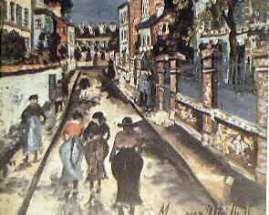
Thursday, 10 December 2009

Stories do not a Painter make.


The artists of the Proto Renaissance were the forerunners of the science of vision much of their efforts went into conveying a story. Now we have so many forms of moving images and still images created at the touch of a button, the value of painting now lies entirely in the act of painting, that is in the observation made by the artist and his idiosyncratic ability to put this study into paint.

Painting now is only of value if done by a genius. Now that story telling has so many other forms of expression there is no value what so ever in low-grade painting. There have been many claims that poor painting is rather good because it is the message that give it value. And which have not only been supported, but enthusiastically championed by ‘art experts’. One such is Professor Griselda Pollock’s championing of Frida Kahlo whose work can only be described as painfully immature; lacking in all that long list of artistic values.


In fact lacking so much more than Seurat, Cezanne, or Hockney, that she is on the borderline of primitive. (Primitive by the way is not a compliment it just means someone who is visually illiterate). Her work usually has reference to the female struggle or, as with her husbands work, the oppression of the Mexicans. To put this into perspective my question would be: do these almost primitive works on the buildings in Ireland by supporters of the IRA or the Loyalists make the painters artists because they convey a message. I will save Griselda Pollock both time and effort in trying to work out the answer, no of course not. Whether it is a message by Frida Kahlo the IRA or Loyalists supporters or Magritte the answer is a resounding no. I say no but I really mean: I think we are safe in saying that it is unlikely that we would find anyone who would argue with this. In other words I do not want anything I write to seem proscriptive. I am the last person to want to throw out the baby with the bath water. I love the eccentric and wacky, I am only pointing out the uncontensious boundaries. There have often been artists in the past who have said this or that is art and thereby, this or that is not art. Such as the constructavists who made great play of their path being the only correct path and that representationalism was not art because it could never be as close a representation of that which it copies;

Robert Delaunay “If art relates itself to an object, it becomes descriptive, divisionist, literary. It demeans itself by imperfect means of expression, it condemns itself, it is its own negation.”

But this would not have been the generally accepted view. For with, our baseline example Jan Six this is not a failing. My aim is only to eliminate those aspects which are not in contention. This will inevitably call for a degree of reasoning but hopefully not reasoning which contains any fundamental debate. Hence the choice of the paintings on the buildings in the Irish conflict. It has never been claimed to my knowledge that the message here has given rise to the painters being elevated to great artists. Therefore I think it wholly reasonable to set this against the unreasonable and unfounded claims of Professor Griselda Pollock. My antenna alert me to the danger of visual illiterates when I hear someone trying to use reasons which are other than visual to establish that a painting is a visual work of art. It is to my everlasting amazement that one from the art service industry reinforced the belief that the story line in the painting was anything by a subordinate element. When asked by an interviewer on a radio programme; what made a painting, in the case “Bacchus and Ariadne” worth so many million, was it the way in which is was painted, the story line, or the fame of the artist? Matthew Collins replied “Not the bloody story line. Bacchus and Ariadne are not that interesting.” One cannot help thinking why would anyone think, the story line. Until one realises that to some the painting is no more than a picture. The floundering for a reason confirms this. To a visual illiterate it must be so confusing to see people derive so much from a mere picture sometimes of no more interest than the painters face. If the art of the painting count for nothing then it is easy to understand the enormous growth of the contorted and mythical meanings of art; some of which we have attempted to explode here.

Tuesday, 17 November 2009


I watched The Art of Eternity on BBC 4 last night and saw the most awful gaff by surprise surprise an Art Historian when referring to the arch of Constantine 315AD claimed that Raphael was incorrect when he wrote to the Pope expressing the idea that the Arch epitomised the decline from that great glory of Roman sculpture at the top, to the barbaric primitiveness of the post Christian relief further down. The Art Historian Andrew Graham-Dixon was supported in this strange belief by Heather Robinson, a Canadian academic. Their belief was that the somewhat feeble post Christian relief was artistically feeble because they had other priorities (religious) over and above perspective. Believe it or not I am happy to side with Raphael.

Do these people not realise, the contradiction in saying that these more primitive artists chose to dispense with perspective, and yet decided to include perspective which did not make sense.


Do they not see that the work itself is primitive and belies the idea that they were capable of better in any direction. They exhibit the classic clumsy big head little hands syndrome of primitives. This is typical of people who have not managed to understand and disentangle vision from symbols and can be seen in the work of children or visual illiterates i.e. people who have not made the necessary neural connections in the part of the brain which deals with visual literacy. This developmental deficiency is similar to that of tone deafness, dyslexia or infact clumsiness. And can be seen with MRI scanners.
The worry here is of course that the art historians contradicting Raphael are in the same boat as the primitives and are thereby not equipped to see the truth of Raphael’s statement.

It would be all well and good, if odd to say, a painter or sculptor had decided to incorporate some glaring mistake, if every other aspect shouted genius. But when every aspect of a work is screaming inadequate, primitive, then it is far to say that the work is by an inadequate primitive. Not only big head little hands syndrome, infact no understanding of proportions in general, poorly observed and executed material and anatomy, clumsy heads with big eyes etc. etc. etc.


Where as the earlier work shows a distinct artistic ability: well proportioned relationship between head, hands, eyes etc. Correct muscle definition, folds of material correctly observed etc. etc. etc.


Friday, 13 November 2009

OF EQUAL OBJECTS THE MOST REMOTE LOOK THE SMALLEST.

Leonardo illustrated the problem and solution as follows:

OF EQUAL OBJECTS THE MOST REMOTE LOOK THE SMALLEST.

The practice of perspective may be divided into ... parts [Footnote 4: in ... parte. The space for the number is left blank in the original.], of which the first treats of objects seen by the eye at any distance; and it shows all these objects just as the eye sees them diminished, without obliging a man to stand in one place rather than another so long as the plane does not produce a second foreshortening.
But the second practice is a combination of perspective derived partly from art and partly from nature and the work done by its rules is in every portion of it, influenced by natural perspective and artificial perspective. By natural perspective I mean that the plane on which this perspective is represented is a flat surface, and this plane, although it is parallel both in length and height, is forced to diminish in its remoter parts more than in its nearer ones. And this is proved by the first of what has been said above, and its diminution is natural. But artificial perspective, that is that which is devised by art, does the contrary; for objects equal in size increase on the plane where it is foreshortened in proportion as the eye is more natural and nearer to the plane, and as the part of the plane on which it is figured is farther from the eye.


And let this plane be d.e. on which are seen 3 equal circles which are beyond this plane d. e, that is the circles a. b. c. Now you see that the eye h sees on the vertical plane the sections of the images, largest of those that are farthest and smallest of the nearest.


Here follows what is wanting in the margin at the foot on the other side of this page.
Natural perspective acts in a contrary way; for, at greater distances the object seen appears smaller, and at a smaller distance the object appears larger. But this said invention requires the spectator to stand with his eye at a small hole and then, at that small hole, it will be very plain. But since many (men’s) eyes endeavour at the same time to see one and the same picture produced by this artifice only one can see clearly the effect of this perspective and all the others will see confusion. It is well therefore to avoid such complex perspective and hold to simple perspective which does not regard planes as foreshortened, but as much as possible in their proper form. This simple perspective, in which the plane intersects the pyramids by which the images are conveyed to the eye at an equal distance from the eye is our constant experience, from the curved form of the pupil of the eye on which the pyramids are intersected at an equal distance from the visual virtue.


Pedretti states: “ this is not true” “ that Leonardo had eventually recognised the necessity of representing object foreshortened laterally and as proof, one should consider the note that explains the diagram in MS E 16V: “let the plan be d.e. above which are represented three equal circles that are placed behind it, that is circles a. b. and c., you now see that the eye at h. will perceive the images of the distant objects on the plane as being larger than those that are nearer”. Thus the diagram clarifies what Leonardo meant in speaking of simple and complex perspective (This is incorrect the diagram in total shows the difference between artificial and simple perspective. This intersecting plane d. e. is the first part of Leonardo’s description demonstrating the problem of Alberti artificial perspective. That the more distant objects become larger than the nearer objects on this intersecting plane). Pedretti continues: Simple perspective is that which is produced by the intersecting plane furthest from the eye (No this line is not referred to by Leonardo and that is the reason it is not allocated letters: it is not an intersected plane but a demarcation line on which these circles are placed). Pedretti: and complex perspective is that which is produced by the intersecting plane closest to the eye (No this is the actual plane d. e. describing artificial perspective of the Alberti method). Pedretti: we can see therefore that complex perspective is actually composed, as Leonardo explains, of natural and artificial perspective. That is why in his diagram Leonardo added a curved line only in the case of the intersecting plane closest to the eye. (A word on the lines referred to by Pedretti as being closest and furthest from the eye. First there is absolutely no difference between these two lines they would both intersect the pyramid in the same way. Secondly, to repeat myself, the line furthest away is not a line of intersection it only a demarcation line on which the circles are placed that is why it is not allocated letters. All relevant points: circles, intersecting plane, and eye are allocated letters).

Not only are these points factually incorrect there is an underlined lack of comprehension of the main thrust of the thesis. Carlo Pedretti comes across as someone who is not only unable to follow the reasoning of Leonardo he is clearly blind to both the problem and the very elegant description of the solution. The problem should strike anyone who investigates the translation of the 3D into 2D. That is, they should realise the dilemma between painting an anamorphic
representation which replaces the object if seen from a certain position or paint using lateral perspective i.e. how we see the world. The greater the length of this window: the wider the angle of view, the greater the distortion if we think of our angle of view as 180 degrees the window would be infinitely long but with Alberti perspective we do not need to go down that route, Alberti perspective presents problems at any angle of view. Take for example a drawing of buildings the buildings will not converge as they reach for the skies, If there are two buildings one each side of the canvas they will present the disconcerting appearance of falling outward. This effect can also be seen in works where the Euston Road School has been followed to the letter as in these examples by Coldstream. Although Coldstream was knighted for his contribution to the arts (could this be another oversight by the A.I.S. another example of a gatekeeper not doing their job) Did he not realise that as the plumb line is following the vertical lines of the buildings which perspective is making converge i.e. as the plumb line is in the same 3D world as the buildings on which perspective is acting that the plumb line will be acted upon in exactly the same way. Thinking that the plumb line means parallel to the side of the canvas is a common beginner’s mistake or as it seems in this case also a more long-standing practitioners mistake. When using the Euston Road plumbing of points it is necessary to use horizontal measurements to determine any convergence of such mapping. If we return to the window the similarity with the plumb line will be apparent. However, to make matters worse the same effect operates in all directions laterally on the window. Carlo Pedretti’s ignorance of this gives serious cause for concern. At any level this would be worrying, but at what maybe considered the top end were technical aspects are being explained this is quite unacceptable. This is the equivalent of a top professor at psychics explaining Einstein’s theory of relativity and getting it wrong. Making it very clear that he does not grasp the relevance and then being given a special honour in return for his lack of comprehension. Yes that would be ridiculous in any other field, but why should it be any different in the art world. Although this new classification of visual literacy seems to present problems in other disciplines professor Richard Gregory, professor of perception in his book ‘Eye and Brain the psychology of seeing’ when discussing Young’s experiments with the spectrum writes ‘it is not possible to produce any colour that can be seen. For example, brown can not produced, and neither can the metallic colours, such as silver and gold’. I am sure the reader will not need me to point out that gold and silver are not colours.
It is obviously disappointing that we have someone in Pedretti that is unable to follow Leonardo’s elegant description of this phenomena. But it is of more concern to find, yet again, someone who very clearly suffers from a visual illiteracy, to whom all this is a closed book, operating within the art world and at such a level. The high expectations demanded of the concert pianist or mathematical genius, are obviously not applicable to the visual arts. Again we discover that in the visual arts, operating at such a low level is part of the course and that visual illiterates not only go undetected but are the gatekeepers. The important part of this diagram is not understood by Pedretti that being the curved line indicating that near and far objects need to be measured at the same distance from the eye to avoid the Alberti anamorphism, In practice an artist may be seen holding a pencil vertically at arms length to measure a near object and swinging around with the pencil still at arms length thereby maintaining the same eye to pencil distance to measure the far object.
Pedretti states: “this curved line represents the lateral foreshortening of the panel. Leonardo never states that the size of the object, as they appear on the curved line of the intersection, should be translated on to the intersecting plane of artificial perspective
First, the plane of artificial perspective is Alberti perspective why would he propose translating on to this. Yes this curved line will indicate that the panel along with everything else will as Leonardo says, “diminish in its remoter parts”. Leonardo: “By natural perspective” “The plane on which this perspective is represented is forced to diminish the remoter parts”. (Causing the regretted anamorphism). But Leonardo differentiates between natural perspective which will do this and the measuring of objects at equal distance from the eye by the curved intersecting plane of simple perspective with the phrase “and hold to simple perspective” I suggest that “hold to” does mean use this method.
I suggest that “hold to” does mean use this method Leonardo goes on to say: which does not regard planes as foreshortened, which I feel Pedretti should take as self explanatory. It is also very clear by the phrase before this that straight line intersecting plane should be avoided “only one can see clearly the effect of this perspective and all others will see confusion”(anamorphism or complex perspective),“it is well therefore to avoid such complex perspective and hold to simple perspective in which the plane intersects the pyramids by which images are conveyed to the eye at equal distance from the eye, we are given constant experience thanks to the curved form”. Put simply this is how we see, distance and size are inversely proportional that is if the same object at the side of our vision is twice as far as the object in front it will be half its size. On a straight plane intersection the greater the angle of view the greater the distortion, this distortion will be familiar to anyone who has looked into a convex mirror if we consider we have an angle of view of 180 degrees. Fortunately we have a computer which de-scrambles this convex mirror effect. This mechanism of perception is so effective that until it is spelled out by this inverse law, we are not aware of this lens effect. However, although we see the equivalent of a convex mirror to put this down to 2d would not give a fair representation of what we are used to. This is not only due to our perception computer, but because our main area of focus is a much smaller angle of view. Cameras and TV aim at a very small angle of view for the very reason of keeping the distortion to within acceptable limits.

Tuesday, 10 November 2009

An Art Historian's attempts with the technical side of Art.

I dare say that there are some out there who think I am being too harsh on the Art Service Industry, yet in other disciplines it would be unthinkable for those who evaluate in any way shape or form not to draw attention to inconsistency. In the more technical areas that would go without saying. How will the art service perform in the more technical area of the arts. I’m afraid there may be a disappointment ahead for those who think that the latitude displayed in the evaluation of painting is not indicative of the weak mental rigger in general. 


The written work by Leonardo ‘Trattarto Della Pittura’ contains an observation on perspective the manuscript to where this can be found is MSMS E 16V. The evaluator in question is Carlo Pedreti professor emeritus of art history at the University of California someone who is held in such high regard that amongst his many honours and awards of presidentship of this and that, gold medals and honorary degrees is the highest recognition that the United States of American government can bestow a congressional citation. It would be difficult to express how highly revered he is in the art world, let us see how justified this veneration is.

Although it is difficult for people today to comprehend, the early artists of the Renaissance or Proto Renaissance did not understand perspective. If we look at works by Giotto or Duccio or Fra Filippo Lippi etc. even artists as late as Mantegna their perspective is so disconcertingly askew, I con not help thinking, if it looks so wrong and I hope it did look wrong to them, then why not just work out what perspective was. I like many have never had a perspective lesson in my life neither at school or art college. One can not help thinking why they found it so difficult after all paintings found in Pompeii exhibited better perspective and some work in the Vatican caves exhibited perfect perspective also rules has already been formulated for perspective by Alhazen in the 11c. . However, the Renaissance rules were set down by Alberti and are known as Alberti perspective although Brunelleschi had produced similar results sometime earlier. The upshot of this perspective is in fact an intercepting screen across the visual cone or visual pyramid as Alberti calls it. Put simply, to draw the view onto a window. Brunelleschi method essentially sounds different but is in fact Identical. He produced a painting on a panel with a hole in the centre. Antonio Manetti in his book ‘ The life of Brunelleschi’ describes the process in which a mirror is placed in front of the painting and the painter looks from the back of the panel through the hole at the reflection of the painting. The mirror is moved in and out of the visual cone enabling the painting to fit the view precisely ensuring the painting fits the view precisely. Although you may no doubt recognise the similarity the real relevance will become apparent in due course. For the problem with this type of translation is that it produces anamorphism imagine extending the length of the window i.e. widening the angle of view and the distortion will become more apparent. This is the type of illusion in the painting The Ambassadors by Holbein of a skull which is elongated but can be seen in its proper form by viewing it from a very acute angle. A more practical example would be the very convincing pavement paintings of holes in the ground etc.


Below is the same image viewed from the wrong side


It maybe worth injecting a note of caution here by saying, do not jump to the conclusion that because these holes etc. look so convincing that this form of 2D representation is satisfactory.

This is an extreme if brilliant distortion producing the illusion.


Leonardo explains it perfectly:


Wednesday, 9 September 2009

It is often said the best Game Keeper is a poacher turned Game Keeper

In the same spirit I will be an artist forced to turn critic.

The people to whom the Roger Fry and Herbert Reid interpretation will appeal, will have a certain psychological predisposition. I hope it does not seem too scathing to say it is the people at the lower end of the spectrum who would welcome the reassurance that if their work was like Cezanne’s that this was a good thing. These people can often be spotted grouping together to foster and reinforce this belief. As we have established that painting is not photo realism and that the slash of paint for a button hole in the painting Jan Six was a good thing then who could argue that the dislocated shoulder in Cezanne’s painting, The card player, was a bad thing. And to the many practitioners who find figures difficult it must seem a welcome relief to find a less rigid stance or one which emphases composition. Plus if the dictate is from a higher authority it often brings with it an irresistible force. Also we can not ignore the constant refrain of out with the old and in with the new from each successive generation. A demand for what they see as the staid painting of old to be invigorated with a touch of wild abandonment. I was that solider. As a student one of the posters in my bedroom was a painting by Vermeer and to my shame I thought why is this boring painting supposedly of some artistic value. Strangely enough the staff at college seemed just as confused. Few would deny that the Cezanne shoulder was anatomically incorrect or that the feet and hands in virtually all of Seurat’s work were too small. To say that these anomalies are artistically justified takes some not inconsiderable clever footwork on the part of the claimant. First I propose to outline or reiterate parameters of art, which are not in contention. And secondly to deal with the ever-present defence of composition, used for example to validate why this arm is anatomically incorrectly positioned. This belief that is fostered, that these are the works of a genius and these anomalies are artistically justified does not hold water when faced with the unremitting artistic incompetence of every other aspect of these works. The consistency of the unrelenting feebleness of a lower order of ability is too compelling, there is never any aspect that a non-artist or beginner would do. No aspect from the long list of drawing, colour, structure, anatomy etc etc etc is ever more clever more interesting more artistic or handled any differently than if done by a beginner. To any visual illiterate who either can not see this or does not understand its relevance let me assure them that from a more visually literate stance, no doubt remains.
There is an undeniable inner voice of objective acknowledgement, which says a good drawing is a good drawing and a poor drawing is a poor drawing. If when comparing these two drawings the question were put would it ever be right to say that the poor drawing is better than the good drawing, I dare say the answer would be an overwhelming no. A brilliant drawing by Michael Angelo appeals to some objective understanding of good drawing, it is an affirmation of an ability which is higher up the ladder of what has been defined by the word art. Its is measurably superior: in the translation of the retinal image, proportionally, anatomically, in the creation of 3D illusion and in the deft handling. The poor drawing says by exposition that these abilities either have not been acquired or have not been acquired to the same degree: there is a demonstrable lack of visual literacy and a lack of understanding of the medium and an inability in the handling of that medium. These facts are not in contention.
There is perhaps a presumption that it is only the top end of the ability spectrum that speaks so loudly and eloquently about the author. The Taoist philosophy of calligraphy would say, irrespective of the subject matter, 'any mark made says something about the author'. People should think of this when they argue that the new generation will introduce a wilder, less inhibited kind of painting. A most revealing case is that of Jackson Pollock, of whom his wife said, in the book 'Look at yourself'" He had no talent 'just ambition'". This lack of talent is very evident in his figurative work, such as his self portrait and this rather embarrassingly juvenile painting of big eyes and even big eyelashes, which seams more reminiscent of a young girls note pad doodle than any thing to do with art. But the interesting point is his decision to produce the drip paintings. I presume in an attempt to disguise these failings. But due to his visual illiteracy he was unaware of the signals this was sending out. So I should add was virtually the entire art service industry.
It is a well known fact to every child not to mention disappointment that mixing all the colours of the rainbow far from making a bright vibrant effect as hoped, results only in a muddy depressing mess. Unfortunately Pollock did not seem to notice this, also Pollock’s decision not to use the right paint for the job, for reasons best known to himself, results in a nasty effect often leaving the paint to pool and form a most unpleasant rippled skin.
In 2006 (I will confirm or amend this date later) a woman in America bought a drip painting from a car boot sale. The seller was asking $7 she knocked him down to $5 and happily returned home with the painting. Sometime later a male friend said what if that was a Pollock, to which she relied ‘what the heck is a Pollock’. After explaining he suggested she should contact an expert from Sotherbys New York. Although reluctant she eventually called them, on arriving to view the painting the expert laughed and said ‘of course it isn’t, anyone could have done that’. Not one to give up, her friend suggested they phone an expert from Christies New York. The expert obliged travelling all the way out there and again laughed and said 'anyone could have done it’. After being persuaded a third time she eventually called a Pollock expert, who said exactly the same. However, the friend pointed out fingerprints, which had been left in the wet paint. He said ‘shall we check them with the fingerprints on the Pollock in the Guggenheim’? And yes believe it or not they were the same. Not surprisingly it was soon up for sale. How much did it fetch?
$147 million.
First, what price experts?
Secondly, no one can tell.
Thirdly, there’s a clue here, if you want a Pollock do your own.


The idea that any of this is the result of free and wild abandonment is a fallacy in fact the reverse is true. This work does not correspond to the confident uninhibited bravura of our bench mark Jan Six's exhibition of genius in observation, ability and in the deft handling of the medium. These paintings scream out, at least to anyone steeped in painting which should include the arts service industry, that these works are by an anal retentive visual illiterate who lacks the insight to understand what they are screaming. This would not cut the mustard in the Taoist circles and neither should it in any circle remotely connected to art. So with a view to removing what seems to be a refuge for the hangers on who find it a cushy number which gives a bit of arty kudos I suggest we begin the elimination of those who lack the ability to operate in the art world by saying: any one in the arts service industry who has not noticed at least one of these expositional signals and exclaimed it at the top of their voice from the nearest soap box should either be forcibly removed or resign forthwith, repaying the money they have earned under false pretences.

Tuesday, 11 August 2009

The Art Service Industry, part 6

Seurat
But what of Herbert Reeds choice of objective artists. We find a few pages later he refers to Seurat as a genius and one who ‘gave precise expression to the idea of objectivity’
If we refer to the painting ‘an afternoon at La Grand Jatte’ a more stilted painting it would be hard to find, we find that the figures have no resemblance to the retinal image what so ever, the hands and feet are far too small, a tell tale sign of a lack of visual understanding. The sitting girl, centre holding a pose, shows no understanding of a head, again hands too small, no understanding of hair in visual terms, granted a very difficult area. The floating dog does not help the situation. The lack of visual understanding with regard to the trees or grass or any aspect of surface quality. The ladies hat, one of three sitting figures bottom left, the inability of the painter to produce the illusion of the flowers going around the hat indicates a very low grade ability and a fundamental lack of understanding of physics, even though Herbert Reed says that Seurat understands science. The hat, head, body and hands show a woeful lack of the understanding of the retinal image, anatomy, physics, proportion, drawing, modelling, surface quality, tone, the lost and found of the Impressionist, colour, the medium, structure, resolution, perspective, both linear and aerial and the inevitable psychological homunculus. This catalogue of short comings of this low grade artist is not aimed as a criticism of the artist but to describe the disparity between reality and what the art historian sees as objectivity.

The Art Service Industry, part 5

Vermeer


Maid with a milk jug


As we have seen from what has gone before it seems that there is a wide discrepancy between the none artists view and what the artists where aiming to achieve or in fact where achieving. Herbert Reed goes on to touch on Impressionism, a movement which could have be said to have had its waters muddied, by its title, suggested by a critics slur: That the paintings where merely impressions.
Herbert Reed speaks of Impressionism as a subjective movement. However, the truth is somewhat different the movement emerged parallel to the invention of photography. Painters had a big break through when they realised that a camera did not see objects as separate entities, as in a bottle on a table, two separate objects, but as patches of light. The bottle may be lost and found in the tones and colours of the table. A second and just as important aspect was that the grainy resolution was oblivious to distance, hence the trade make rain effect of Impressionism. Nether did the mindless machine pay any attention to the psychological precedence. Equal treatment was given to all areas whether a finger nail sized eye or a finger nail itself.


The Art Service Industry, part 4

Cezanne

Cezanne

Now as we move through the centuries although there are peaks and troughs the general direction of this graph is onward and upward. And we eventually arrive at the Impressionists and the next big step along this journey.
When I was a student in the sixties suggested reading was Herbert Reed a Concise History of Modern Painting. In the opening pages he refers to Cezanne and suggests that he was the first artist to be objective: ‘let us ask why in the long history of art it had never previously happened that an artist should wish to see the world objectively'. Firstly, I hope I have made it abundantly clear that the entire period of the Renaissance was devoted to the retinal image. But secondly, has this much respected and influential historian never heard of Vermeer or seen his ‘Maid with a milk jug’.

The Art Service Industry, part 3

Jeff Koons
Art is a western concept, where the visual representation moved away from the symbolic. The Renaissance began when the problem with symbolic representation had been recognised, this was the beginning of a journey.
Piero della Francesca broke objects down geometrically;
Alberti defined a form of perspective, the tracing of the subject on to a screen (window). Although it sounds like the definitive solution unfortunately this form of perspective does not acknowledge lateral perspective;
Anatomy and figures became a primary area of study, with the aim of overriding the psychological homunculus epitomised by the Byzantines all with the objective of establishing the retinal image. To be able to override the psychological homunculus and produce a human figure closely approximating the retinal image turned out to be so difficult it became the litmus test for visual literacy. So difficult is the psychological homunculus and there by the test of visual literacy, that ever since, art colleges have the study of the human figure at the centre of their curriculum.
The next step along this path is as important as the first and could be considered as modifying the meaning of art. This step is the acknowledgement of the medium. Rembrandt in his later works such as his Kenwood House Portrait and his National Gallery portrait and his painting of Jan Six . These are no longer the drawing and colouring in of the Renaissance they are interpretations in the medium of paint. To the uninitiated this may seem an arty distinction, but an analogy with music may dispel any idea that this is either woolly or arty language. At this point on the journey the mechanics of the Renaissance are no longer the major concern in the same way in which Hendrix’s no longer had to mechanically pick out the notes as a lesser guitarist may. This is where the word art takes on the meaning of something special, where a stroke of genius can be seen to shine out from a smudge of paint. I suspect that the epistemology could bare this out.
However, it is unlikely that Rembrandt would be bothered one iota whether he was called an artist or a painter, though I suspect it would not be academic to Jeff Koons whether or not the $2.16millon Hoover in the Perspex box was granted the label of art, in fact if I may be so bold I suspect the price would fall faster than a speeding bullet if it were suggested that it was not a valid work of art.
Let me say that I make no apologies for making it my aim to bring into question the validity of such claims. But excuse me I am getting ahead of myself. To return to the main theme and in particular the commentators depth of understanding or otherwise of the pre retinal image. An example of the commentators understanding can be seen in Gombrich’s comments referred to earlier in this writing.
Here we have a very clear picture of the commentators and their influence.

The Art Service Industry, part 2

Although vision is part of that perception, visually this symbol has very little resemblance to mummy. Gombrich in his book 'Art and Illusion' asks the question "a problem which has haunted the minds of art historians for many generations..........will the paintings we accept as true to life look as unconvincing to future generations as Egyptian paintings looked to us?" What Gombrich fails to understand here, and it seems fellow art historians, is that the Egyptians were illustrating perception.
This is not a progression, as Gombrich suggests where painting improves with time, this is pre disentangling vision from perception. I hope the minds of art historians are hence forth released from this haunting (I excluded those who were so much further up the artistic ladder than Gombrich that they were never so haunted) So the reader is left in no doubt of Sir Ernest Gombrich's status in the art world I list his honours and credits below:
Gombrich, Sir Ernest (Hans Josef) (1) Knighted 1972. (2) CBE 1966. (3)FBA 1960. (4) FSA 1961. (5) PhD (Vienna). (6) MA Oxon & Cantab. (7) Director of the Warburg Institute & Professor of the History of the Classic Tradition in the University of London 1959-76. (8) Research Asst. Warburg Inst., 1936-39. (9) Research Fellow, 1946-48. (10) Lectr, 1948-54. (11) Reader, 1954-56. (12) Special Lectr, 1956-59, Warburg Inst., Univ. of London. (13) Durning-Lawrence Prof. of the History of Art, London Univ. University Coll, 1956-59. (14) Slade Prof. of Fine Art in the University of Oxford, 1950-53. (15)Visiting Prof. of Fine Art, Harvard Univ. 1959. (16) Slade Prof. of Fine Art, Cambridge Univ. 1961-63. (17) Lethaby Prof. RCA. 1967-68. (18) Andrew D. White Prof-at-Large, Cornell, 1970-77. (19) A Trustee of the British Museum, 1974-79. (20) Mem., Museums and Galleries (formerly Standing Comm. on Museums & Galleries),1975-82. (21) Hon. Fellow, Jesus Coll., Cambridge, 1963. (22) FRSL. 1969. (23) Foreign Hon. Mem., American Academy of Arts and Sciences, 1964. (24) for. Mem., Amer. Philosophical Soc., 1968 (25) Corresponding Member: Accademia della Scienze d Torino, 1962. (26) Royal Acad. of Arts and Sciences, Uppsala, 1970. (27) Koninklijke Nederlandse Akademie van Wetenschapen, 1973. (28) Bayerische Akad. der Wissenschaften, 1979. (29) Royal Swedish Acad. of Sciences, 1981. (30) Hon. FRIBA, 1971. (31) Hon. Fellow: Royal Acad. of Arts, 1982. (32) Bezalel Acad. of Arts & Design, 1983. (33) Hon. DLitt: Belfast, 1963, London 1976. (34) Hon. LLD St Andrews, 1965. (35) Hon LittD: Leeds, 1965, Cambridge, 1970, Manchester, 1974. (36) Hon., DLitt: Oxford, 1969; Harvard, 1976. (37) Hon. Dr. Lit. Hum; Chicago, 1975; Pennsylvania, 1977; DU Essex, 1977. (38) Hon. DHL Brandeis. 1981. (39) Hon Dr RCA, 1984. (40) W.H.Smith Literary Award, 1964. (41) Erasmus Prize, 1975. (42) Hegel Prize, 1976. (43) Medal of New York Univ., for Distinguished \Visitors, 1970. (44) Ehrenkreuz fur Wissenschaft und Kunst, 1st cl., Austria, 1975. (45) Medal of College de France, 1977. (46) Orden Pour le Merite fur Wissenschaften und Kunste, 1977. (47) Ehrenzeichen fur Wissenschaft und Knust, Austria. 1984.

What we perceive can give us shorthand we know as symbols and introduces a value judgement: what is the most important aspect of this subject? When the subject is a person, this value judgement shifts up a gear, the physiological impact of the face of this subject takes precedence over feet or knees, the eyes on this face out rank any other feature. When these features are translated into 2D their precedence is ranked by size. In reality eyes are give or take, about the size of finger nails, yet if we look at the Byzantine example we can see that they are relatively enormous. This dysmorphia continues into the Proto Renaissance, tiny hands and big heads are all too apparent in works as late as Giotto. Medically speaking this type of image could be called a physiological homunculus. Why civilisations should react like a child is a mystery, but whether by a child or a civilisation this sort of work can not really be considered art. Even during the early period when the problem began to be addressed the proto Renaissance artists such as Cimabue 1240 - 1302, Duccio 1255 - 1318 and Giotto 1267 - 1337 I would have a great deal of difficulty calling this work 'art'. The Renaissance can really be considered the science of vision, it is interesting that civilisations which produced the symbolic representations prior to the science of vision, such as Japan with the Hokusai wave approach, don’t have a word for art.

The Art Service Industry, part 1

How we see the art world is very much influenced by the commentators:
The art historians, the art critics etc.
The term art historian carries with it an implied degree of knowledge about the quality of art. However, although they may have the best of intentions it is quite possible for an art historian to learn all the dates and movements etc, but be unable to acquire the necessary ability to access quality. Often the claims made about many art historians understanding of art or painting are not always justified. Commentators in other disciplines such as music, maths or tennis are usually exponents in that particular field. In fact it would be unthinkable to have a commentator in maths who was not a very considerable exponent. Reading between the lines it soon becomes evident that many art historians understanding of art is flawed. Before we deal with this in any depth, it is often expedient for artists to go along with the writings of commentators, in fact it would not be an exaggeration to say that artists careers are made by a certain symbiosis. Each giving the other what is required to drive the market, this is fine when both are in a reified atmosphere, the realms of genius. My concern is that the recent past has seen a rise in the less visually literate becoming involved in the arts. As often or not it seems more like the blind leading the blind, beginning with that transition period known as the Modernists. That period from the late 19th century to the early 20th century. The question is, is it now time for a review of this period? Hind sight is never a bad thing, is it now time to say that some of the information that we were fed was not always correct. I know from my own experience that some of the information from Art College was not factually correct. Coincidently I saw the same information repeated recently on a TV documentary on art i.e. that the some what strange sinewy images painted by Cimabue where done in this fashion out of choice. The art historian on the documentary made a point of saying that Cimabue could quite easily have painted a more representational image. This a fundamental flaw in the art historians understanding of the painter. The art historian continued with how wonderful the eyes were in the Byzantine paintings and he reasoned that they had been painted in this way to seem elemental and filled with awe. Art historians often have the idea that if someone is called an artist they are automatically granted a God given talent, that they can paint like Michael Angelo and that any divergence from this is through choice and certainly not through lack of ability, they seem to misconstrue sheer inability for design. Byzantine work can be considered analogous to a childs attempt at producing a picture. They both confuse symbols with vision. Nicely illustrated in Ernst Gombrich’s book Art and Illusion, where another art historian, this time a much celebrated art historian, suffers from a more dramatic example of this misunderstanding.


When a child draws mummy as a round head with eyes, nose and mouth and strands of hair, a triangle for a dress with two arms and two legs sticking out, this is a symbolic illustration of the child's perception, the child perceives the mummy and draws a symbol for that perception.

Channel 4 Life Class

Congratulations to Channel 4 for putting on the Life Class, a resurgence of interest in art is very welcome. It is therefore doubly sad that no one could have made a less worthy attempt than those selected. Although I was not credited, I had written to Channel 4 suggesting a life class programme, and although I was warned that television companies will pinch anything, surely they did not say ‘this is a good idea, but instead of some guy from the sticks we will use proper artists, such as RA’s etc’.
Well they have certainly proved what I was trying to illustrate. I could not have hoped for a better result, they have surpassed my wildest imaginings. Instead of berating them I should be offering my heart felt thanks.

The reason for suggesting a Life Class programme was to reveal exactly what the program did reveal, that it is not unusual for those who claim to be artists or visually literate to have their claims disproved when tested in this way. In fact even in this short programme one of the authors: Humphrey Ocean, claimed that his work was as close to a photograph as a painting could be. A claim which was to make his low grade attempt that much more poignant A life painting is the litmus test of artistic ability. It makes it very clear whether or not the author is visually literate.
My premise is that 99% of those claiming to be artists are not only patently unable to substantiate this when it comes to the time honoured test but are actually congenitally unable to be artists. That is they have not developed neural networks necessary for the task. This gives us an awfully large pool of people out there, often in institutions set up for the best of artists, making what many would consider, a considerable amount of money, by what would in any other circumstances be called conmanship. And no one either willing or more importantly able to questions this. Using someone who can paint figures as a baseline, I would be happy to offer myself as a baseline. Those who wish to question my ability can be the first inline for the challenge.
Is it now time to produce a proper investigative programme: to ask the questions which everyone knows need asking but are not being asked. Interestingly the producers who were given the Life Class programme which I suggested were connected to the ICA, recently slated by one of their own, (Chairman) Ivan Massow, who said the British art world is in “danger of disappearing up its own arse … led by cultural tsars such as the Tate’s Sir Nicholas Serota, who dominate the scene from their crystal Kremlins. “Most art I see now is pretentious, self-indulgent, craftless tat that I wouldn’t accept even as a gift. “I must confess that, for a number of years, I’ve had a nagging voice in my head telling me it’s all hype and frequently no substance”.


Maggie Hamblin (channel 4 Life Class)

The first programme had Maggie Hamblin referring to the neck as a column, this is one of the fundamental flaws of what might be termed the psychological homunculus i.e. the strange creature shaped by the psychological aspect of the perception of a human: big head , big eyes, little hands and little feet etc. Although the Greeks were obsessed with the naked body, our tradition of the life class, which became the centre of the Art Education Curriculum and the ultimate test of visual literacy could be said to have begun because of the badly drawn figures of the Byzantine, with all the flaws stated above, plus the familiar column like neck. A neck unless forced to do otherwise leans slightly forward travelling through the V or better still inverted W of the almost vertical sternomastoids. It is reprehensible to ignore something of such structural importance in a life study.


Humphrey Ocean (channel 4 Life Study)

In the second Life Class the artist was Humphrey Ocean, not alot to say about this other than it has not reached the level to be called art,but then again none of them reach a level which could be referred to as art.
Put simply Art has a definition, the O.E.D. states: it is the skilful execution as an object in its self. Implicit here is that Art is at the top end of the ability spectrum. A few would argue that it is comparable to a Concert Pianist or mathematical genius: a genius with a given medium and just as a Concert Pianist is not someone can just play chopsticks, an artist is not just someone who can scrawl a figure. Why should I be bothered, because it is a wrong which needs righting.
How has this come about? I took my annual pilgrimage around the R.A. recently, an institution set up by an artist for artists, and although I was not surprised, many were. It seems that networking is the only art form of any importance in the art world. There is also the sheer ignorance of selectors, with the R.A. there will be ignorance and editing out the better work of the public. Where as with the B.P. awards I suspect it is ignorance. The B.P. award was designed to promote and encourage painting. Yet all but a handful were copies of photographs, most will realise the huge gulf between copying and painting, certainly from the comments of those attending the exhibition, many thought it was completely unacceptable. This is not the fault of those submitting work, an exhibition is only the selectors exhibition, Rembrandt could have sent work in but this selection panel would not have included him. Please please please only use selectors who are visually literate.
What should be done? A life study is a very clear test of visual literacy and no one in the visual arts should be visually illiterate, commentators and judges in other disciplines are always exponents in that discipline. A challenge should be sent to individuals who are deemed visually illiterate. If they fail they should surrender their privileges, such as those conferred by the R.A. etc. If these people were occupying these positions under false pretences in any other area, the Police would be involved.

If anyone out there could download Channel 4's Life Classes before they are hurriedly removed (such an indictment will not stay there for long) and provide me with a link, I would be eternally grateful.

Tuesday, 28 July 2009

Confusion


Here I hope that some of the confusion which surrounds the art world will be cleared up.
when considering art and its manifestations it is recommended to always keep in mind, human nature. If anything is held in such high regard and confers such status on to the recipient do not be surprised to find that people will go to extraordinary lengths to be associated with it.
Before we devote anymore time to human nature an example maybe helpful. One of the main manifestations of this human frailty is artists who, artistically speaking would have difficulty tying their own shoe laces, being elevated in the art world. One such artist is Utrillo, this low grade visually illiterate amateur has been elevated to an arena in which he does not look terribly clever. Unfortunately for someone on such a brightly lit stage he can be seen very clearly to have no ability in any artistic direction what so ever. Neither in drawing, painting, perspective, tone, seeing colour, modeling, proportions, aerial perspective, subtlety, surface quality, resolution, understanding of vision, understanding of perception or the awareness of the psychological homunculus.


Let me make this clear, this is not some personal tirade against Utrillo, this is not an artist I have a lot of interest in either way. I am pointing out failings that by anyone's standards indicate someone of very poor artistic ability. Further more he must not be confused with someone who has been sold as a primitive or someone where an ironic element is to be considered, he is of the School of Paris and said to be a follower of Pissarro. To compound the confusion, in 1957, Utrillo was said to be placed, as far as purchasing value is concerned, among the greatest artists of the 20th century. Even today some 'art' collectors have paid prices approaching a million pounds to have one of these works on their wall.
The implication here seems to be that bluffing is a necessary prerequisite in the art world, for surely no one could have seen this as bad art and then decided to pay so much money for them, that they are elevated to the greatest valued 20th century works. In fact bluffing is so much a part of the artistic world that you are probably more aware of the sham which parades its self as artistic understanding than 99% of the people involved in it.
Want to read on then visit http://www.ecclestonstudio.com/eccleston_studio5.prologue.htm